Simple Design Tips for Developers
I've got a very small list of hobbies, namely reading, writing, coding, gaming and designing. Coding being my ikigai (Japanese concept that means "a reason for being"). Designing on the other hand was something I did to make cool monograms for myself but during the learning phase of designing I did learn a few things, I think as a developer you can accommodate these tips pretty easily without having a lot of design knowledge.
There's been numerous posts about this already and probably better ones but let's give it a try, shall we?
The post uses https://reaper.is and https://tillwhen.barelyhuman.dev as references for a lot of things and that's because the points I mention are implemented on both. Even though TillWhen still has some UI inconsistencies, considering it has other UI Kit's involved and I can't just throw them out without actually getting the functionalities done first.
There's basically 3 concepts I want to cover here
Spacing
If we go through https://reaper.is for a brief second you can see everything follows a consistent spacing standard and this is what I call spacing harmony , it's not a new concept but something very simple that people forget.

If you observe, we have the same amount of vertical and horizontal spacing in the 2 lines of buttons. Now this is not the only place where this is being used. Point being though, having a base spacing amount and using it's multiples to decide the spacing works wonders.
8px is my magic number for spacing and its multiples are used around the
website. Some people start of with 4px since it works well in mobile devices
but I'd recomment you use device specific spacing measurements when working with
mobile screens to avoid making the spacing too small on hidpi devices.
Why is it important ?
Spacing and Typography create a sense of hierarchy between elements and while Typography tells you what you should read first, spacing tells you what items are together and what items are not. This gives you a general idea of the relationship between elements is.
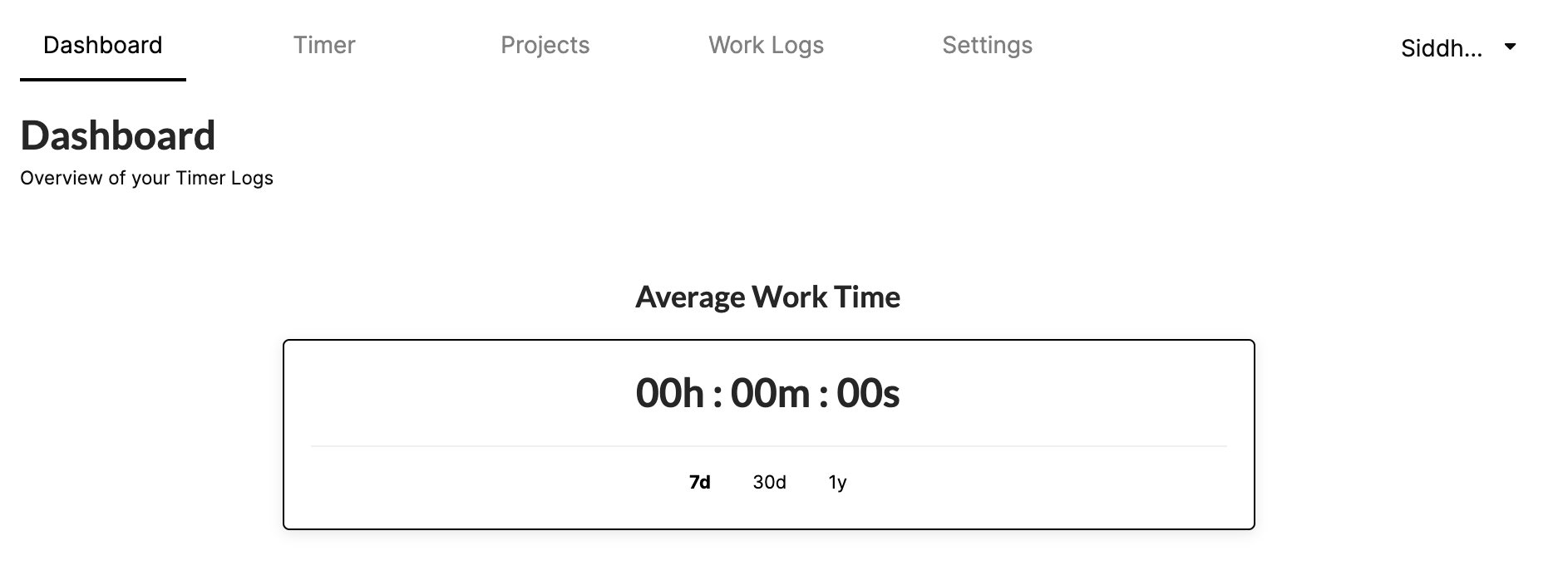
A good example would be the spaces that split the Navbar from the page title and then page title and subtitle having minimal gap to show that they are grouped and then a massive gap between that and the data cards, making clear separation between elements that are together, and elements that are subsets.
Typography
I've already mentioned what role Typography plays in designing and if you get good with typography and spacing, you don't really need a lot of design knowledge to get a good looking design up and ready.
I'm in no sense a master of this but have been experimenting with it for a while now and you are reading on a blog that's been testing this very approach.
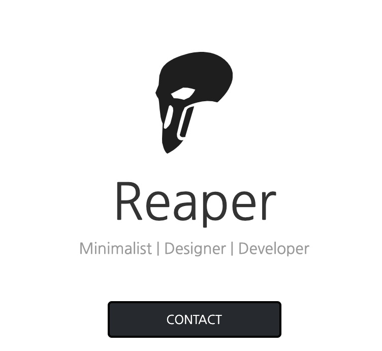
Let me guess you saw the logo first, the name next and the contact button next and the subtitle last ? If that's the order you had then I was successful in maintaining a good Visual Hierarchy. If not, then ....
Getting a control of what the user reads and the way he flows through your content makes it easier for you to decide what you want them to do.
This is equally helpful in Apps as it's on blogs.
Layout and Alignment
This is probably the only tip that almost all frontend developers already know. The thing about Layouts is that one layout never works for everyone and everything.
But, a general rule of thumb is to make sure everything lines up perfectly. (Thanks, captain obvious.)
Though, it doesn't change the fact that almost every design we see today is over designed and have each element follows it's own sense of alignment. (You can preach about minimalism later...)
Forget others, TillWhen's login email is a centered card with text left aligned and justified as needed with a huge center aligned button (Hypocrite much, reaper?).
These design choices can change based on what pleases you aesthetically but following a grid makes it all easy. Using a good grid system always comes in handy if used properly. I've seen people nest rows inside rows inside rows with bootstrap. Don't! Just Don't!. Learn to use flexbox instead.
Layouts will help you get prototypes out quicker and probably why css libraries like Bulma, Bootstrap are drop in defaults from the dawn of their existence in most web frontend projects even today.
I'm not sure if theres anything else that I can add to this.
Adios!